Fundación La Fuente
La Fuente is a private non-profit organization that promotes and implements cultural and educational programs in underprivileged areas of Chile.
The Beginning
La Fuente was seeking to redesign their website in addition to update their communication strategy, putting in value the foundation’s mission: to promote and implement cultural and educational programs in underprivileged areas of Chile.
It was a must from La Fuente to keep the same CMS they were using (WordPress) because their old website already had more than 1.000 posts and they were familiarized to one kind of content management.
It was a 3 people team for this project, including a Project Manager, a Graphic Designer and myself performing as Web Designer and Developer.
The Opportunity
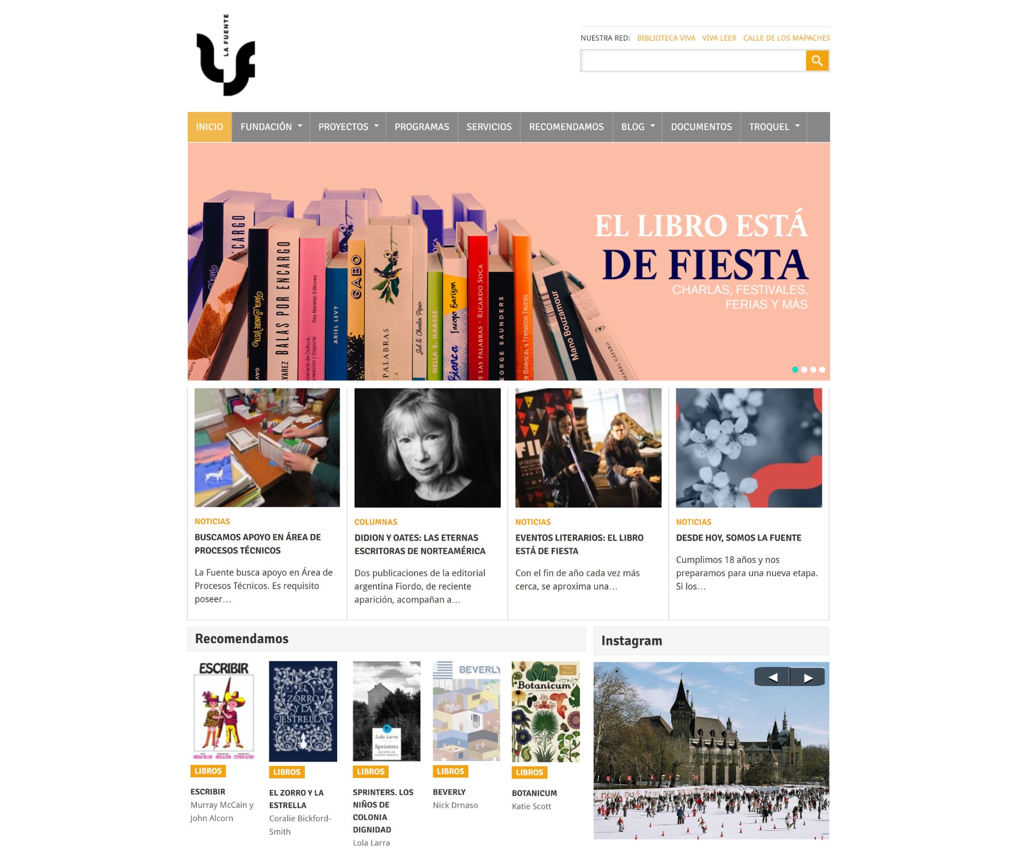
After a deep examination of the current website structure and its content in addition to quantitative data delivered by La Fuente, we conclude a mismatching between what they were communicating and what they actually wanted to communicate. The old website looked like an Art & Literature portal and their labour wasn’t clear enough.
More than a redesign, we proposed to reformulate the whole information architecture in order to emphasize La Fuente’s mission and its social programs.

The Research
Due to a very limited budget, we decided to ran an in-house survey plus an interview with the workers related to the website such as editors, content writers, designers and directors. La Fuente also gathered and gave us relevant data from their audience feedback obtained through the website contact form and Social Media.
We were seeking to understand what they like the most of the current website as well as what they consider confusing and irrelevant.
In addition to the qualitative information, we collected Google Analytics data and compare both. We realized there were many sections with a low rate of visits. Our first thought it was because a non-strategic layout which spoils the view but all these sections were at the home page, well placed and included on the menu bar.
The Problem
We state as the problem a lack of content organization. Many sections belonged to the same category but were divided into different sections. For instance, six different pages were talking what is La Fuente about instead of gather and organized it in one single page. Besides, some sections weren’t relevant regarding the communication strategy.
The Solution
Once we compare qualitative and quantitative data, the findings didn’t match completely hence we decided to develop a hybrid prototype which we could testing once live.
Blending content, reorganizing them and filter the irrelevant ones allowed us to reduce it in proximally 30%.

The Challenge
The most complex was to create a new website keeping the old content. La Fuente’s old website used a WordPress theme from 2014 which means posts were created using an outdated editor. Nowadays WordPress works with a new editor (Gutenberg) hence we had to migrate more than 1.000 posts and make them match with this new version. This was a problem because due to the nature of the new design, the migrated posts presented a bunch of graphic discordances and looked very odd.
To solve this situation, I wrote a special script that recognizes the old and new posts, which allowed me to assignat different classes depending on the originally used editor and keep the proposed design in both.
Besides, we had the challenge of time. La Fuente couldn’t stop the content post which means the migration to the new site should be quick and without errors to don’t interrupt the day-to-day of editors. Therefore, before the official migration, we tested the website multiple times in other servers as well as La Fuente’s server, using their current database to ensuring the migration process were as smooth as possible.
The Outcome
Both, La Fuente and we were satisfied with the final result. The audience, in general, gave positive feedback and celebrated the new website.
Editors quickly adapted to the new WordPress editor and, in terms of data, since the launch it has been an increase of 20% in page views which means the audience can fluently navigate through the content.
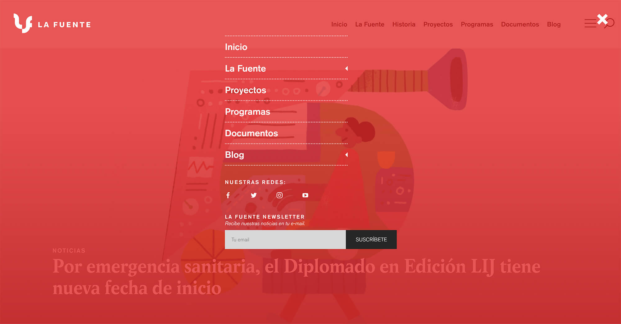
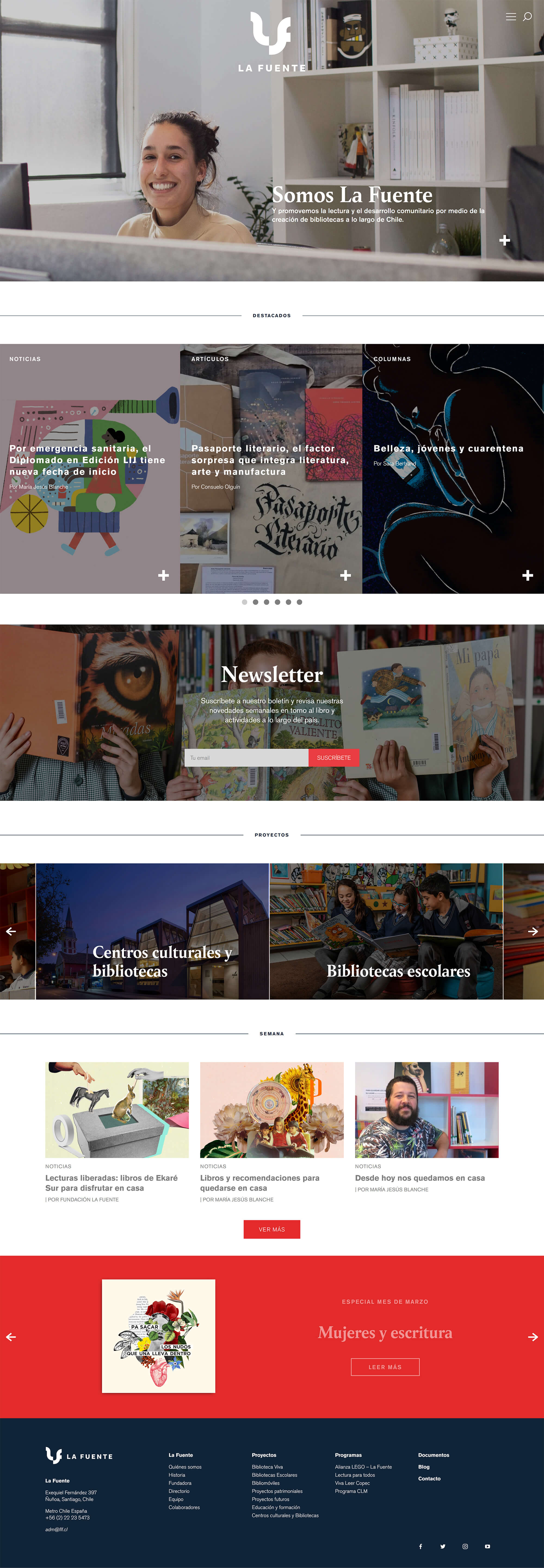
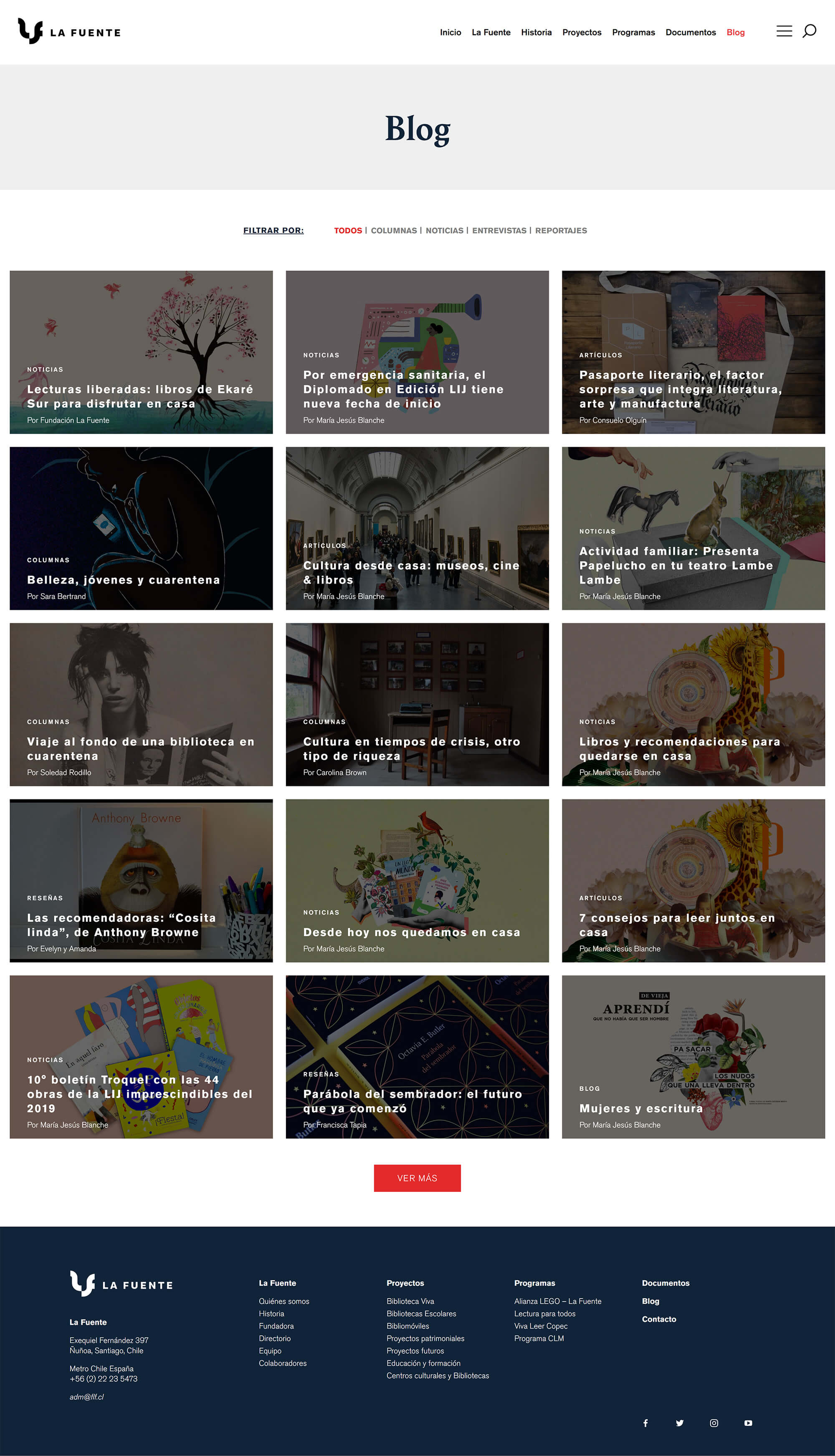
Below are some relevant screenshots from the final result.
Homepage full view

History full view

About full view

Blog full view
